The Product Strategy group at Rocket Central is made up of design, technology, operations and research, The Sharepoint acts as a location for internal resources for team members. The site is a go to place for team members to find career training and job oriented content or research content made available for review in new product initiatives.
A collaborative effort was put into the redesign for the Product Strategy Sharepoint site. The team came from a variety of disciplines: Ux writer, Information Architect, Ux researcher, Operations and a couple of interns. The site before our redesign was a mess and was typical of an intranet source in which content was added and managed organically, rather than edited and managed systematically. Our job was to review it, reorganize it, cut out unnecessary content and release a more aesthetically attractive, streamlined and useful tool.
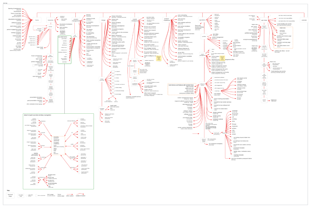
My first job for this project was to conduct a heuristic evaluation and create a site map of the content, and all the links. The result was a large, overwhelming map with links going everywhere, redundant information, broken links and no sense of place or meaning. I produced the site map in a Lucid Chart board so that all team members had access to it.
From there I took screen shots of each page organized them into breakout boards from the original site map for context. It was important for the team to know what content should remain and what should not. Each screen shot was organized and displayed in the section it belonged to. The screen shots provided a visual map for editing purposes. Team members added sticky notes, drew lines between screens and circled content. We also brought in Subject Matter Experts to assist in understanding what content was the most important and what was not.
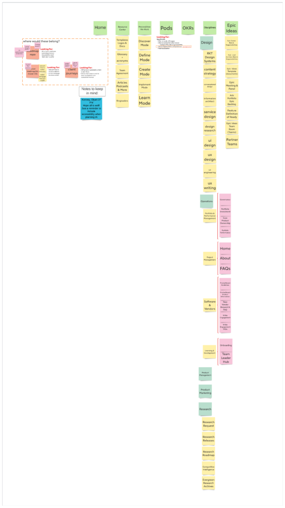
With input and research from other members on the team, I was able to synthesis the research and requests surfaced in that research to create a workable site map which the interns used to update the site. The site map also included questions for next steps in future updates and iterations.
Click on each image to see larger version


